Learning how to design data to blow minds
Data may be at the core of revolutionising finance, business, and digital industries, but visualising it to reveal the story behind the data is a skill that must be cultivated.
Whether it’s a sankey, voronoi, or plain old pie chart, data visualisation is about more than wrangling data into a pretty display, according to visualisation expert David McCandless, founder of Information is Beautiful and instructor of the upcoming IAPA Data Storytelling Workshop.
Enhance your data storytelling skills to convince, convey and communicate with global data viz guru, David McCandless. Enrol in the workshop.
“To reveal what’s unseen or what has not been seen before is what a good visualisation should do,” says McCandless, who began life as a journalist before teaching himself data and design skills to create Information is Beautiful, which publishes daily news, books, and visualisations.
His favourite visualisation is Left Vs Right World, not only for its aesthetic but because it’s a concept map of political ideas as they percolate down from government into culture, families, and individuals.
“It shows ideas and fills some of the gaps that we might have in terms of understanding people that we feel are opposed to us,” he explains.
“When we have those gaps, we tend to fill them with our prejudices so it’s helpful to be able to see what the other side stands for to open up possibilities of understanding and being able to see where someone’s coming from.”
Chatting ahead of the Data Storytelling Workshop, David noted the skills taught in the workshop will help to conceptualise the best data viz approach to tell your data story, strip away superfluous elements and create a beautiful data visualisation that ‘speaks’ to the target audience.
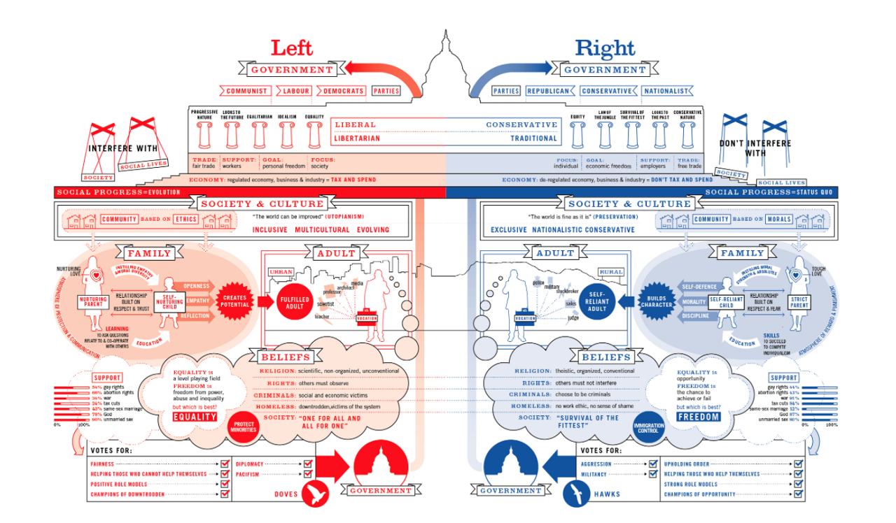
Left Vs Right by David McCandless is a concept map visualisation that helps give people a greater understanding of those on the other side of the ideological spectrum.
McCandless argues there are different types of beauty revealed in a successful or impactful data visualisation, including:
- AESTHETICS: how something looks - it’s form, colours, fonts, and so on.
- DATA BEAUTY: how well structured, informative, and ‘resourced’ the data is
- CONCEPT: how interesting and compelling the ‘frame’ or the headline on the visualisation is
“If you can unify those in a chart or a graphic or visualisation then all of the buttons are pressed for success,” he says.
Beautiful data - how clean and interesting the information is - must be at the heart of a good visualisation, but it’s not the foundation.
McCandless’s favourite data set is the spreadsheet that sits behind the Snake Oil visualisation, which uses McCandless’s own software VizSweet to create an interactive balloon race chart revealing detailed data about the efficacy of supplements and vitamins that a user can click on to read in more detail.
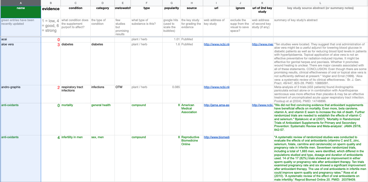
Well structured data needs to be maintained like a garden, says McCandless. This dataset from the Snake Oil visualisation is constantly curated and updated.
“We’ve basically been curating and tidying and updating that data for nearly 10 years,” he says.
“We monitor the stat of evidence around supplements - there aren’t that many that actually have a lot of clinical grade evidence - but we curate it and constantly prune and tidy it.”
He says managing big datasets is like having a garden; you often have to weed it and spruce the beds or trim a bit of foliage to keep it lovely, structured, and beautiful.
All Information is Beautiful visualisations contain links to the data so users can explore how it’s structured for themselves.
Data matters but concepts and storytelling matter more
“I think data people - who know the data has something beautiful in it - immediately leap to trying to display it in a beautiful chart without thinking about it being conceptually interesting as well,” he says.
The IAPA workshop teaches that all data needs a ‘frame’ to reveal a story, not merely a nice aesthetic to display the data.
“People who rightly love the data want to show all of it, but the audience only wants to see what’s interesting or important or relevant to them,” McCandless explains.
The impulse to ‘click and viz’ using different software tools may be hard to resist but converting spreadsheet cells into a chart only visualises spreadsheet cells rather than a story or an idea.
A visualisation should reflect human activities - the story behind things people did to make a line go up or down, not merely information about the information.
The tools are getting easier but the art of visualisation and storytelling remains hard
There is a range of software tools - some paid and some free - that promise to visualise data easily. McCandless likes using Raw Graphs on top of D3 and his own VizSweet tool, but relies more on ideas, concepts, and beautiful data than any single tool.
Most visualisations either plot quantitative information or visualise qualitative ideas but sticking to the so-called ‘rules’ of different chart types - bar charts for this or scatterplots for that - can be limiting.
McCandless likes visually interesting charts like sankeys and voronois, especially when a user can interact with the data that sits beneath it. He argues dashboards often offer a poor experience for people in business who need to use them day to day.
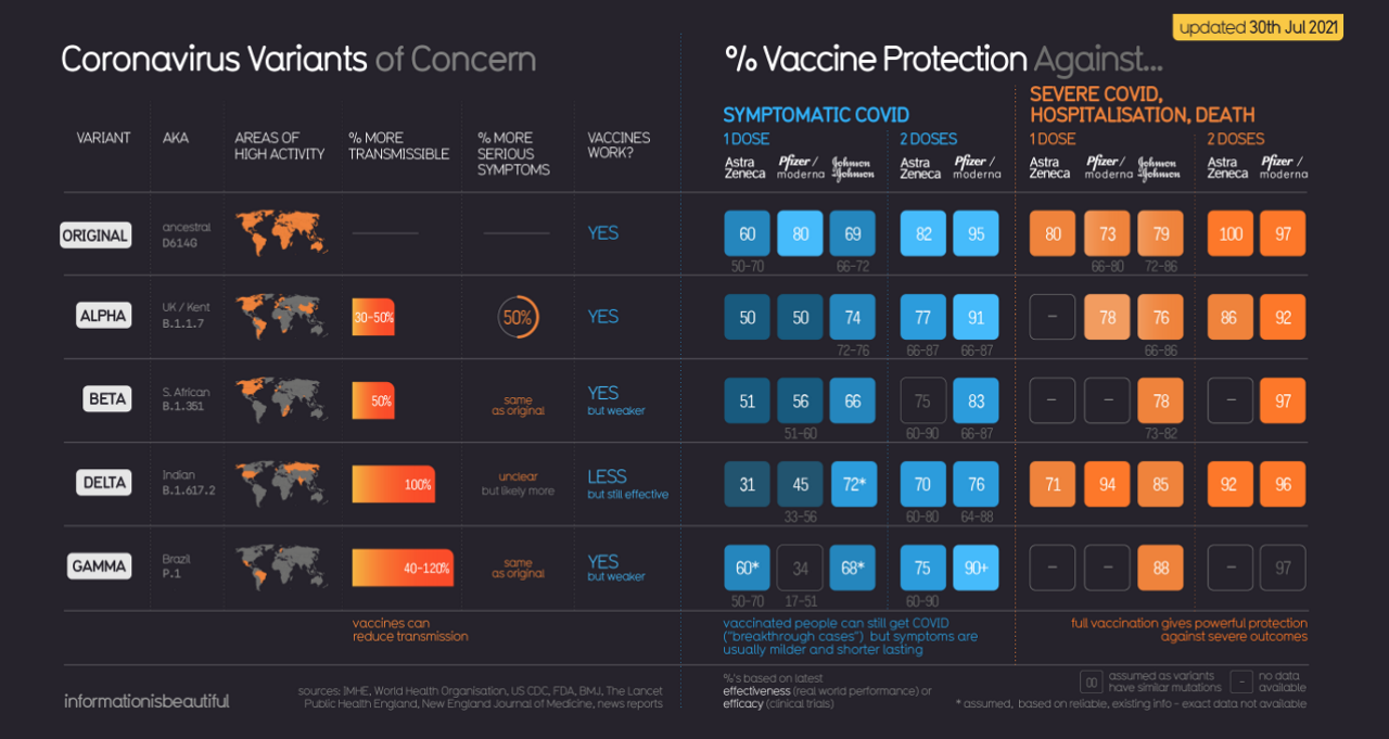
He says his Coronavirus graphic that Information Is Beautiful created offers a multifaceted snapshot of what is going on “which is obviously what you want from a dashboard”, explaining dashboards are useful when the graphics on them are “conceived outside of the data as answers to the questions that people might have”.
Creating unique graphics for dashboards can give them more impact
David offers this to those wondering if they need an existing aptitude for design for storytelling, “I would give one piece of reassurance - I’ve never studied design. I’ve never trained in any visual medium,” he says.
“People come away from my workshops learning new techniques and approaches for their toolbox and ways of going beyond the bar chart.”
The IAPA Data Storytelling Workshop runs virtually from 8.00am to 12.00pm AEDT on Tuesday October 25.
More information and enrolment in the IAPA Data Storytelling Workshop can be found online.